Displays time series or indexed point data. The vAxisMinValue and vAxisMaxValue are used as the range instead of the min/max from the data.
If
padRight is set to true than the chart is padded on the right with the same space as what is used for the second axis legend. This allows
for two or more charts to be aligned that have one or more fields being displayed.
{{display_linechart width="800"  height="400"
fields=""
vAxisMinValue="0" vAxisMaxValue="1.0" padRight="true"}}
Image 1: Line chart
Chart Colors
You can set various colors of the chart with the following properties:
chart.fill="color or 'transparent'"
chart.stroke="stroke color"
chart.strokeWidth="width"

chartArea.fill="color or 'transparent'"
chartArea.stroke="stroke color"
chartArea.strokeWidth="width"

hAxis.gridlines.color="color"
vAxis.gridlines.color="color"
Annotating Charts
Annotations for a chart can be specified in two ways.
The first is to specify one or more data fields to create the annotation from:
  annotationFields="field1,field2,..."
  annotationLabelField="field" //optional for the label
The second way is to specify the annotations using an
annotations attribute:
annotations="
<,index1>,label1,description1;
<,index2>,label2,description2;
...
"
Where <index> is either a date or a numeric index, e.g;
 annotations="
2,A,annotation 1;
2016-06-24,B,annotation 2;
2016-06-24,C,<,h1>,annotation 3</h1>
2017-01-02,D,annotation 4
"
{{display_barchart fields="" padRight="true"}} Image 2: Bar chart
{{display_barstack fields=""}}
{{display_areachart width="800"  height="400"
fields=""
vAxisMinValue="0" vAxisMaxValue="1.0"
padRight="true"
isStacked="true"}}
Image 3: Area chart
{{display_scatterplot width="800" height="400" fields=""}} Image 4: Scatter Plot
The
minValue and
maxValue attributes are used to specify the maximum and minimum evertical data value to render.
More info at
Google charts histogram documentation.
{{display_histogram width="800" height="400" fields=""
colors="comma separated color list"
legendPosition="none|top|right|left|bottom"
textPosition="out|in|none"
isStacked="false|true|percent|relative"
logScale="true|false" scaleType="log|mirrorLog"
vAxisMinValue="" vAxisMaxValue=""
minValue="" maxValue=""}}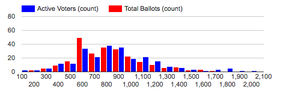 Image 5: Histogram
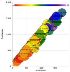
The
fields specify a text field for the label and the numeric value fields used for the x and y axis, the bubble color and bubble size.
{{display_bubble width="500"  height="500"
fields="label|x|y|color|size"
colorTable=""
colors="comma separated color list"
legendPosition="none|top|right|left|bottom"
hAxisFormat="none|decimal|scientific|percent|short|long"
vAxisFormat="none|decimal|scientific|percent|short|long"
hAxisTitle=""
vAxisTitle=""}}
Example
More info at
Google charts pie chart documentation
{{display_piechart fields=""
pieHole="0.5"
is3D="true"
bins="bin count"
binMin="min"
binMax="max"
sliceVisibilityThreshold="0.01"
width="500" height="250"}}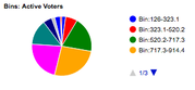 Image 6: Pie chart
{{display_radar fields=""}}Example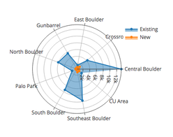 Image 7: Radar Display
{{display_windrose fields=""}}Example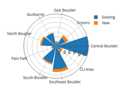 Image 8: Wind Rose
{{display_density fields="tmax,vp"}}Example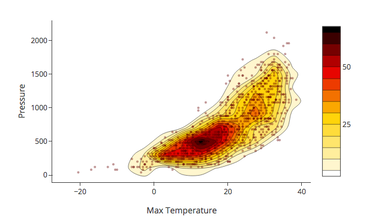 Image 9: Density Display
{{display_3dscatter fields=""}}Example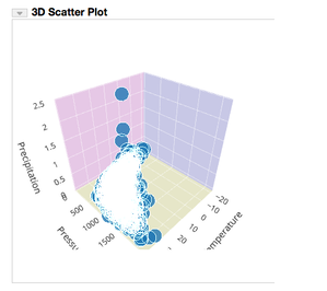 Image 10: 3D Scatter
Displays point data based on the date of each record. The calendar entry is color coded based on the specified field.
If
missingValue is specified than any point value with that value won't be shown.
{{display_calendar fields="" cellSize="15" missingValue="0"}}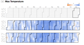 Image 11: Calendar
This shows a single value from a series of point data.
{{display_gauge fields="" gaugeMin="" gaugeMax="" gaugeLabel=""}}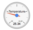 Image 12: Gauge

 Oglala Lakota College License